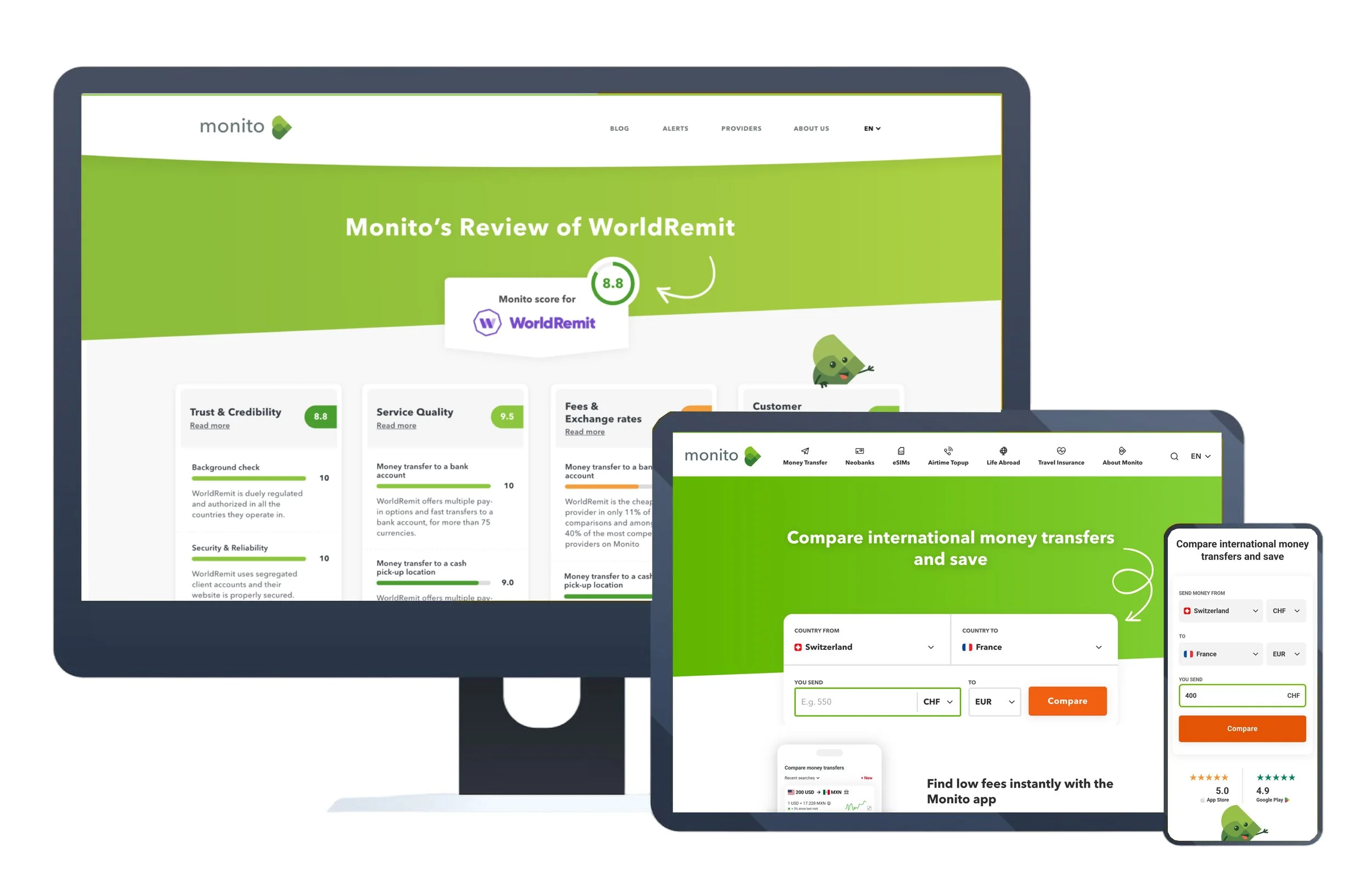
Monito.com
Comparing international money transfers
I led UX Research at Monito, focusing on uncovering user needs and behaviors within the money transfer comparison platform. My work informed design and product decisions by identifying usability issues, improving user flows, and ensuring the experience aligned with the goals of both users and the business.

Duration: 2 years
Role: Senior UX Researcher
Mission:
Uncover user needs and usability issues in Monito’s core features, enabling the team to improve key revenue-driving experiences and establish a sustainable user research practice through ongoing feedback and a dedicated user panel.
Problem Overview
Monito is best known as a money transfer comparison platform, helping users find the best services for sending money internationally. As a secondary function, it also provides reviews and guidance on various money transfer providers. By the end of 2019, Monito was experiencing rapid user growth. However, much of their understanding of user behavior had been shaped primarily by analytics and search engine data, with limited direct engagement with users themselves. This lack of qualitative insight meant the team had limited understanding of the needs and pain points behind key user actions especially across the most revenue generating areas of the site. As the user base expanded, it became clear that in order to scale the product effectively and build long-term loyalty, Monito would need to dive deeper into who their users really were, how they navigated the platform, and what obstacles they encountered in their decision-making journeys.
Solution Overview
We focused on uncovering usability issues within Monito’s core features, specifically the comparison tool and review pages, which directly impacted conversions and revenue. We conducted usability testing and heuristic analysis to identify high-friction areas, validate existing assumptions, and surface opportunities for improvement. In parallel, we developed a user panel from scratch which became an engaged group of real users we could continuously learn from through interviews, surveys, and prototype testing. This not only gave us ongoing access to feedback but also fostered stronger user relationships. The combination of these efforts enabled us to improve key flows, elevate the user experience, and align product development more closely with user needs
Background Information
The Monito product team was a lean, cross-functional group composed of a Product Manager, a UX Researcher (myself), and a UI Developer. Notably, there was no dedicated full-time UX Designer during the majority of my time there. As a result, we approached user experience design collaboratively. While this setup encouraged close teamwork and allowed everyone to have a voice in the design process, it also presented certain challenges particularly around decision-making and ownership of UX strategy. With no one solely responsible for UX design, responsibilities were often shared or blurred, which sometimes slowed progress or led to inconsistencies. That said, the structure also fostered a strong culture of co-creation, and we found creative ways to fill the gaps—through clear documentation, consistent communication, and research-backed decision-making. This environment ultimately made the project more dynamic and collaborative, though it underscored the importance of dedicated UX roles in ensuring continuity and clarity.
The Work
During my two years at Monito, I led and supported a range of UX research initiatives across the product. For this case study, I’ve chosen to focus on one project in particular a deep-dive usability study on Monito’s review pages. This was not only the most comprehensive research project I led during my time there, but also the one I found most rewarding.
The resulting report, which includes detailed findings and recommendations, is not publicly accessible. However, if you're interested in viewing it, please feel free to reach out to me in the below form to request the password.
The study focused on how users navigated the review pages, where they looked for core content, and how quickly they could find information that gave them confidence in their choices. Through moderated usability testing, we discovered that users were more successful when the visual review content was surfaced in the hero section of the page and not the article’s . The current layout placed the article which contained much of the SEO-focused copy at the top, pushing important visual representations of the review insights too far down the page. This created confusion and led to premature drop-offs, despite strong initial page rankings.
What followed was a healthy and spirited internal debate: Should we prioritize SEO performance that brought users in, or UX clarity that kept them engaged? The UX team proposed moving the main content higher and conducting an A/B test to measure impact on engagement and SEO traffic. However, the idea was considered too resource-intensive at the time and postponed indefinitely.
While this outcome was somewhat disappointing, the project taught me a great deal, especially about internal communication, strategic compromise, and the importance of advocating for users while understanding the priorities of other departments. It highlighted the often complex trade-offs between discoverability and usability, and gave me tools to be more agnostic and objective in cross-functional discussions.
On a more personal level, it was also a highly enjoyable project. The product team was collaborative, open-minded, and supportive, making it a genuinely fulfilling experience to lead research and see its influence ripple across design and product thinking.