Air.Car Platform
Zero and Low-Emission routing for the city of london
I was tasked with designing a proof-of-concept eco-routing app based in London, aimed at encouraging users to choose low or zero-emission transportation particularly within low-emission zones or along less congested routes during off-peak hours.
I served as the Principal Designer within a four-person project pod, working alongside a Lead Strategist, Copywriter, and Project Manager. I also collaborated with the Director of Design for mentorship, feedback, and ideation support throughout the project.

Duration: 3 months
Role: Principal UX/UI Designer
In Collab with: Invoke Digital Agency
Mission:
Produce a Proof-of-Concept working prototype of the air.car platform to support a pitch to Tantalum's key stakeholders and board investors.
Problem Overview
Poor air quality has a well-documented and serious impact on human health, making it a public health priority for the city of London. Despite this, most London drivers relied on apps like Google Maps or Waze for commuting—tools that typically (at the time) routed users through the fastest or most direct paths, often passing through highly congested areas. This behavior significantly contributed to the already hazardous levels of emissions in these zones. Commuters were often unaware of the health risks—not only to themselves but to others, including non-human life exposed to pollution hotspots.
Solution Overview
An eco-routing app that educates users about polluted areas along their route and the associated health risks. It strongly encourages alternative, low-emission travel options—such as taking less congested roads, or making broader lifestyle changes by choosing to bike, walk, or use public transport.
The CTO of Tantalum engaged Invoke Digital to develop a working prototype for this concept. Her goal was to pitch it as a new branch within Tantalum Corporation, which she intended to lead.
Background Information
Tantalum corporation was seeking product strategy and design support for their Air.Car platform, beginning with a design sprint to establish initial customer value propositions and produce key user journeys, sketches, wireframes (UX), and a clickable prototype (UI) for internal stakeholders and user validation.
As of 2018, Tantalum's technology touched roughly 500,000 vehicles across London. They were able to collect and analyze real-time data from over 270 vehicle data points, including fuel consumption and engine performance. By leveraging this data, along with insights from local air quality monitoring stations, Tantalum could identify the most polluted and congested areas in the city. Reducing emissions—particularly nitrogen oxides (NOx)—was a core priority for this new initiative.
Understanding the Product
It was important to us to truly understand the passion and motivations of our clients mission to ensure we aligned also on a philosophical level, as well as a pragmatic one. We kicked off the project with a Product Workshop with the client to collaborate on the integral parts of the project ensuring we left with a plan that all counter parts were confident in.
User and customer archetype review – We created an affinity diagram based on existing data from Tantalum, supplemented by group-based assumptions. This exercise helped us meaningfully define early user personas.
User journey mapping – Using sticky notes, we mapped out a core user’s journey through the product, identifying key entry and exit points as well as potential friction for users and technical teams. The output was a shared artefact used to align assumptions and inform future validation during testing and MVP deployment.
Ideation sketches (Crazy 8s) – Each team member created 8 rapid sketches exploring onboarding, re-routing, and lifestyle change scenarios. We presented ideas and conducted a dot voting session to identify the most promising concepts.
Feature specification and prioritisation – We reviewed workshop outcomes to define features, mapped them into likely user flows, and prioritised them by value. We categorised features into priority, backlog, and out-of-scope lists, then mapped them to upcoming sprint plans.
Ideating and Creating the proof of concept
We defined the deliverables for the upcoming foreseeable phases with particular care on ensuring the entire Invoke team was available for in-person collaboration at multiple touch points.
User flows per sprint – We drafted initial assumptions for both user and technical flows in collaboration with Invoke’s technical team, and later refined and validated these with Tantalum. Tantalum’s internal technical team was fairly relaxed about the architecture of our proof of concept and chose not to engage deeply in refining it at this stage. They communicated a preference to handle that work internally after project handoff, once their full team would be available. While we initially pushed for more technical clarity, they were clear in their decision to defer that process until the end of the PoC phase.
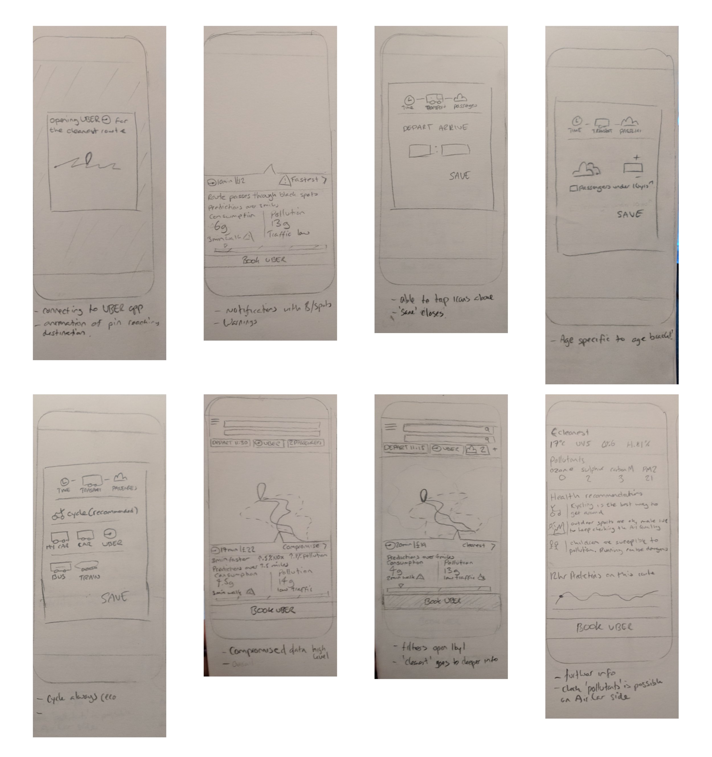
Prototype sketching of interfaces – I always begin on paper. It’s a quick and flexible medium for sketching initial designs and getting a variety of meaningful ideas out for discussion, especially in tighter timelines. For this phase, we scoped out 10 key wireframes to illustrate the overall experience and secure client approval on the narrative, user journey, and technical scope, all of which she would later present to her board of investors. These sketches were discussed in internal white-boarding sessions and translated into low-fidelity digital wireframes, which were then validated by the client, before heading into high fidelity designs leaving ample room for revisions.
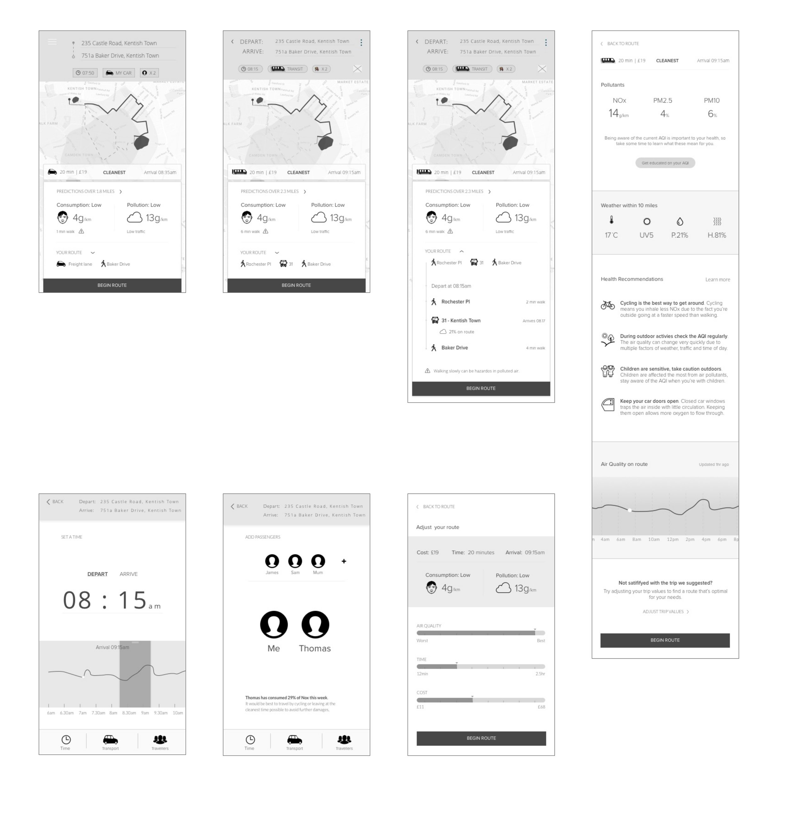
Digital UI style exploration and key screen design – Using Tantalum’s existing logo guidelines, we created multiple UI design variations and presented them to their internal design team for approval. This again was a moment where the internal Tantalum team didn’t have much feedback since the expressed the fact they would likely revise it internally at a later date. We were therefore advised to not spend too much energy on making the designs pixel perfect or creating an in-depth design system.
Clickable prototype – Using Sketch and InVision (which was then an industry standard tool), we created an interactive prototype incorporating approved UI kits and flows. This prototype was delivered to the client at sprint’s end and later presented to the wider team for discussion.

Test and Validation Planning
The goal of these concept validation tests were to understand the motives and frustrations of london commuters as well as their attitudes towards the design concept as a tool to use within their commute.
Defined MVP by reviewing project goals and objectives – Since the initial phases and feature list was scoped very large, we had to reassess the design outputs and journey map to identify any unnecessary features or gaps in the narrative to ensure the experience was succinct and clear ready for testing. This included removing features from the testing plan like profile set up and management, rewards and a proposed educational library feature.
Prepared for testing and interviews – We developed participant criteria based on flow-specific tasks, created testing plans, optimised the prototype to feel realistic, and secured stakeholder consent. Research sessions were scheduled with London commuters at local offices (I worked remotely during this phase and was not involved in the interviews but returned to assist with research synthesis and future prototyping.)
Findings, presentations and next steps – We reviewed the tests and gathered the findings together prior to presenting our hypothesis to the Tantalum team and discussing next steps for a newly scoped phase. Our most interesting and useful findings were
Users did not understand the weight of the health concerns and risks when considering the suggest route on the air.car platform
Users were overwhelmed with the naming conventions and data presented around air quality, rendering them unable to process the weight of the warning
Users were in search of more flexible filters and settings when programming their routes
Users are unlikely to change their mode of transport without more relatable data from recognised and trusted sources.
Our hypothesis around this
Presets – If users can preset modes, destinations (e.g., home, work), and health concerns,
then they will increase trust in recommendations and recurring usage.
Good Choices – If users select transport modes and routes based on desirable attributes (i.e.,
timing, air quality, health, popularity, scenery, etc.), then they will add time or
distance to their trip.
Alerts – If users receive real-time and predictive exposure and emissions alerts, then they will adjust their daily commute modes and routes, and increase recurring usage.
Design updates based on insights – We prioritised feedback by severity and value, addressing critical areas first. Design iterations began with pencil and paper, progressing to collaborative whiteboarding where needed.
MVP refinement and roadmap update – Revised features and flows were mapped to the updated roadmap to prepare for technical planning.